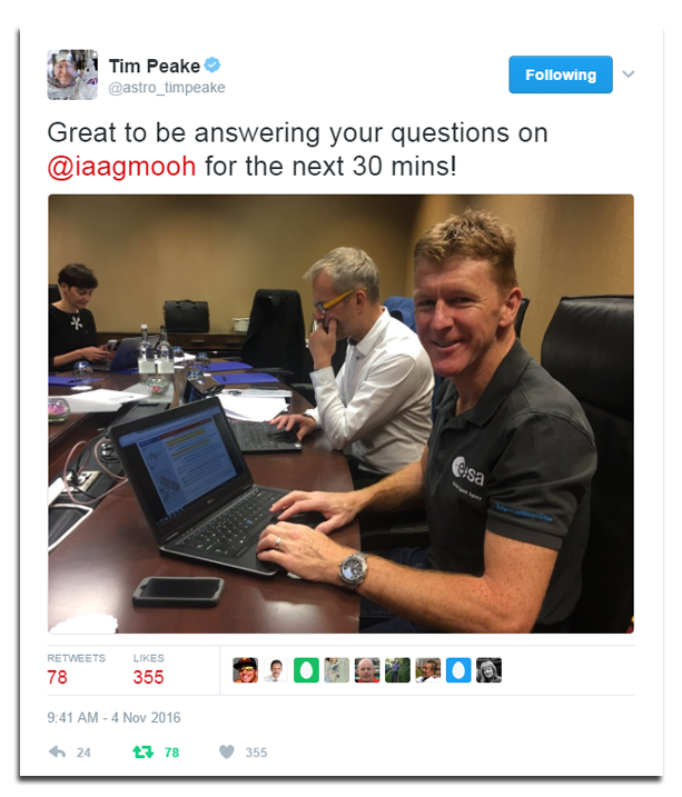
In the last year I’m a Scientist has developed more than at any other time since we launched in 2010. We’ve hired new people, moved offices, moved servers, launched and relaunched multiple international projects (Vietnam, Spain, and Kenya), started projects like I’m a Medic and I’m a Researcher, developed a new Live Chat system (see Tim Peake using it for the I’m an Astronaut event), we even celebrated our company 15th anniversary… And to meet the needs of all these developments we’ve created a sleek new theme for the site.
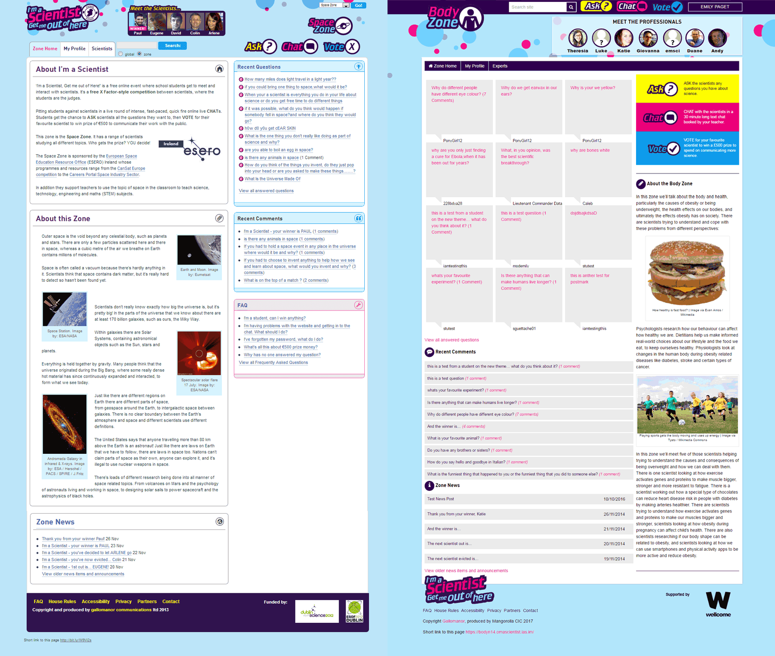
The ‘theme’ is like the skin of the website. It doesn’t really change the functionality, just the style and way it looks. This new theme is a huge improvement over the previous one:
It’s fully mobile responsive – making it more accessible for scientists and students on whichever device they might be using.
It’s flexible and easy to implement – meaning we can roll out events more efficiently and at a lower cost than before (take a look at the I’m a Medic site).
It’s adaptable to other languages and alphabets – so we can keep expanding the event to new countries whilst maintaining identity and voice.
It’s easier to navigate and, we think, much better looking – it also matches the style of the new, astronaut-approved, live chat engine.
The theme has taken an incredible amount of work. The key factors in its design were accessibility, performance efficiency, and using modern systems and methods in creating a user-friendly experience for anyone who visits the site, on any device.
A huge thanks go to our wonderful team of Mike (dev), Lesley (chat dev), Andy (front end dev) and now Luke (front end dev) who have done a spectacular job adapting the functionality to meet more current, accessible standards, and testing everything into oblivion. They’ve succeeded in taking a very old theme and creating a new theme which allows old content to work in its structure, and where new content looks modern and is more accessible.
In the parlance of these times, here is a before (old site) and after (new site) gif:
See the new site up and running live on I’m a Scientist.
We’re also always on the look out for bugs, glitches or anything we may have missed during the testing phase, so if you spot anything that doesn’t work or look right, please email me – emily@mangorol.la.
What’s next
We’re aiming to roll out the new theme across the rest of the projects over the summer, including I’m an Engineer, I’m a Researcher, and international events (it’s already on Ireland). We’ll also be redesigning specific parts of the site, such as the profiles. Thanks to the new theme, it’s now easier to improve the experience of online engagement in response to feedback. We hope you enjoy it.


